It has been a while since I blogged about my hand wired atreus keyboard. In this year I spent some time testing new layouts and experimenting with different keyboards and I think it’s now time to start describing this. As the post title says the quest is infinite but I reached a good milestone.
First some background: I’m primarily an open source software engineer and a system engineer and architect so I spend most of my time writing code and using the shell. I use (only) GNU/Linux from 1999 and my workflow is heavily based on the terminal (and TMUX) and text editors (primarily VIM). The keyboard is my main interface with the computer and I heavily use shortcuts and so modifier keys.
When I was using classic keyboards layout I always hated different things of them:
- Staggered rows: one stupid inheritance from the typewriters. It should have been ditched some decades ago. It makes touch typing a really bad experience due to the asymmetric keys arrangement. I believe that one of the cause people don’t do touch type in these days is caused by them.
- Modifier keys position: having to stretch your pinkies or do some strange wrist contortions to press them was very stressing and was slowing me down a lot given the number of time I have to use them.
I chose the atreus to do the big jump because it looked like a good mix with a better symmetrical column staggered layout and was portable. After experimenting with it and tried different layouts I ended up with these conclusions:
- Finally I was able to really touch type. Now my fingers really know where the keys are since they are placed where they should be.
- I was missing the external keys column (the one for esc, tab, backspace etc…) and putting them in the lower keys or in a layer, given how much I use them, was slowing me down.
- Additionally, probably due to my broad shoulders, the central thumb keys were not comfortable, I probably need them a bit lower and the angle between the two hands a bit higher.
Out of curiosity, I also bought and tried for some time a planck keyboard, it gave me back the additional external column but it was a bit more uncomfortable due not being angled.
In the meantime I also noticed that I was missing an additional row to put the numbers and grave/tilde.
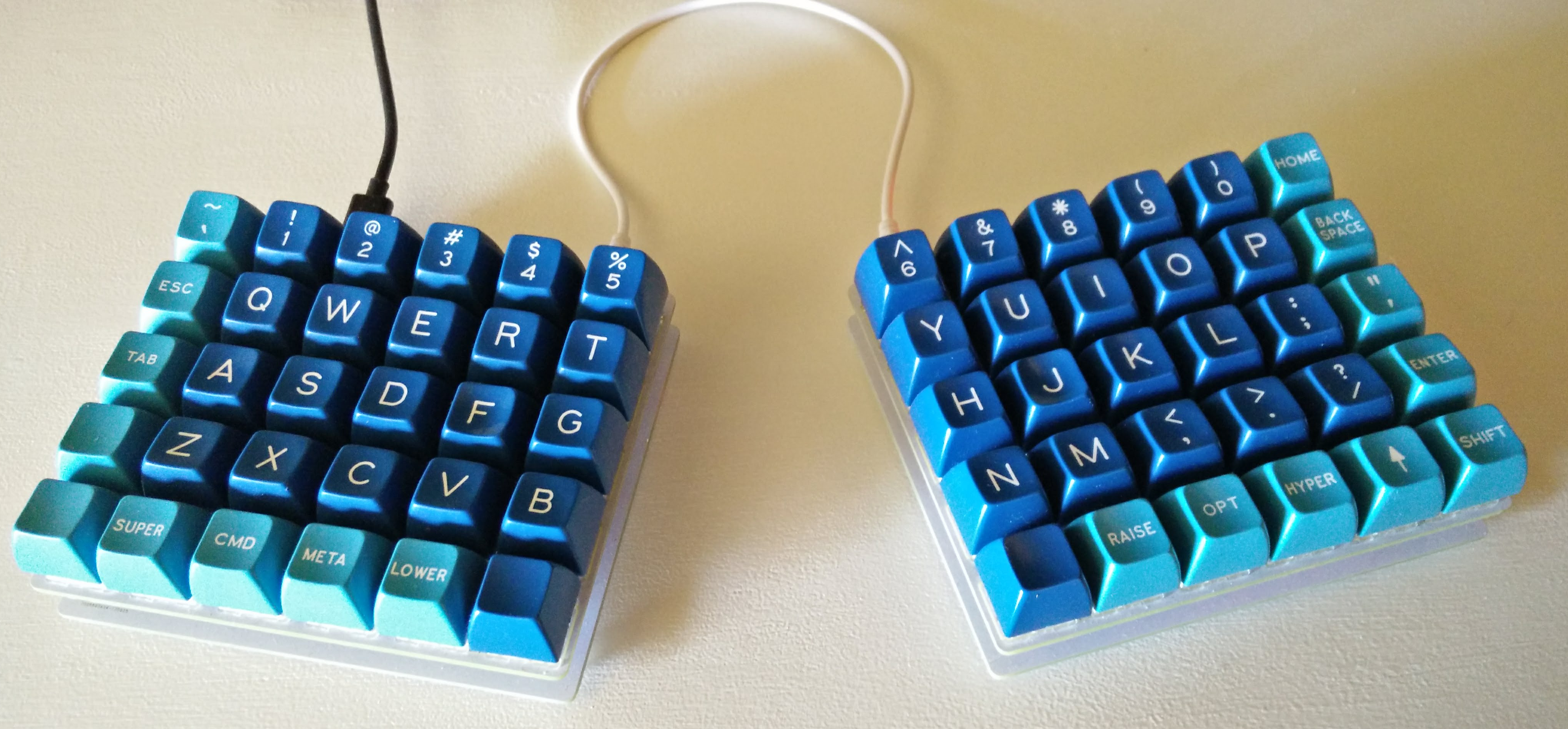
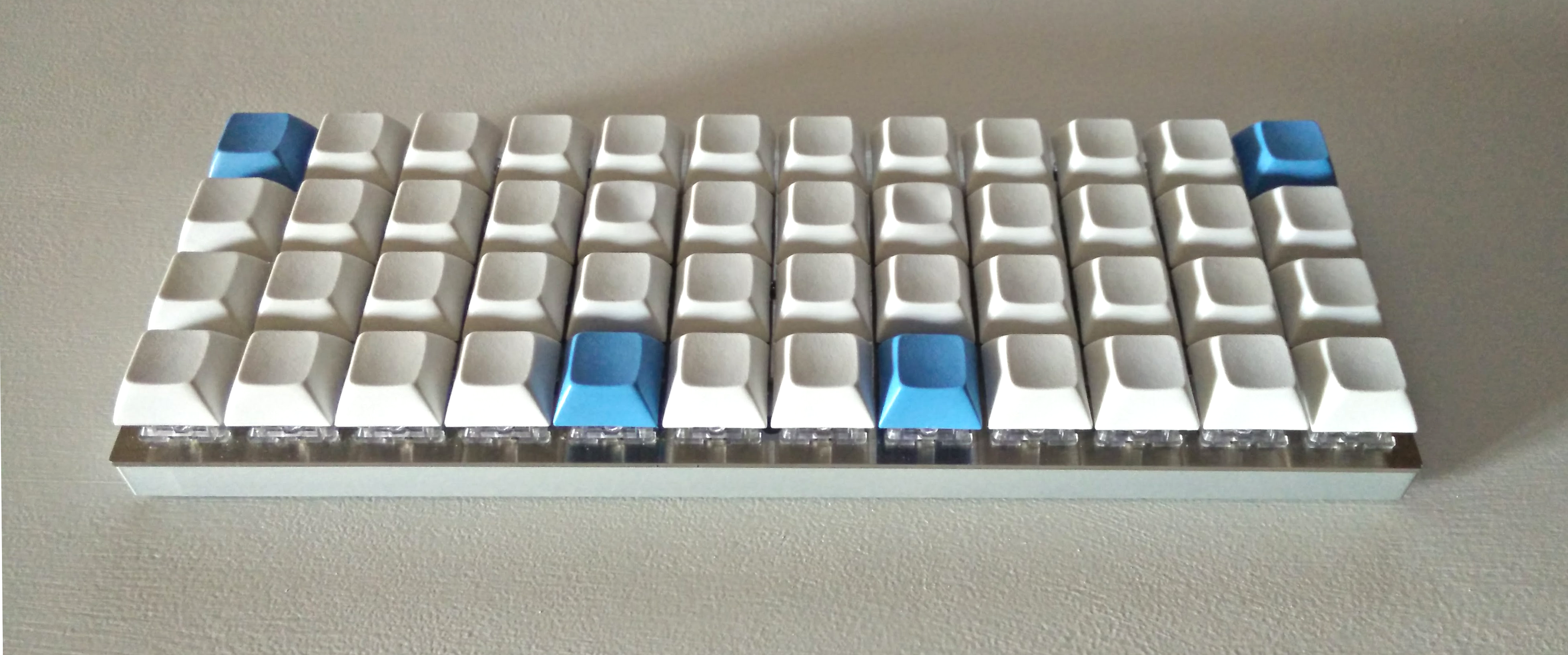
So my next experiment was a nyquist keyboard (a split olkb preonic). And we are coming to the end of this first milestone.
A split keyboard is a great improvement and the additional “number” row of the nyquist helped me to experiment with different layouts.
Current Nyquist Layout
Some notes on the choices/experiments that led to this layout:
I did multiple experiments trying to put the modifier on the home row using QMK Mod Tap feature.
At first this looked like a great idea since I was able to press all the possible modifier combination without moving my fingers out of the home row.
I tried it for few days but I wasn’t able to get used to the visual delay caused by it since, when using the keys set as mod tap, the keystrokes are sent after a tapping term that, also if lowered, for me, was too much noticeable. This bad feeling is increased since the modifier where put on the VI movemnt keys (hjkl). I also tried to move them to the row above and below the home row and it was quite better but not enough and the same trying to move them to the number row.For the above reason my layout doesn’t use any mod tap, layer tap or other double function keys.
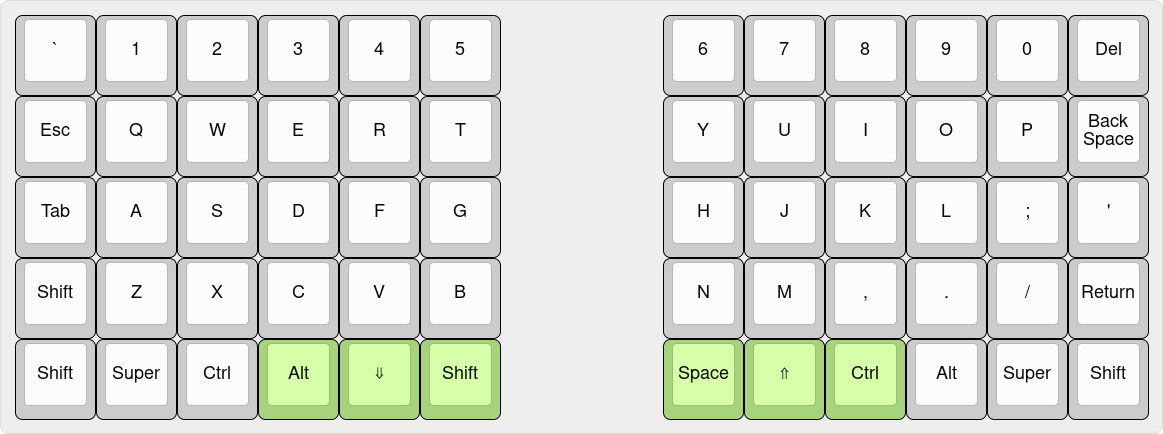
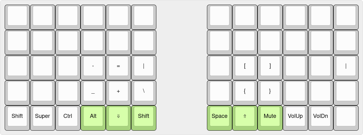
Use the keys pressed by the thumbs (the one in green in the below image) as modifiers. In this way I can do the most common combinations (
CTRL-R,ALT-H,CTRL-SHIFT-P,CTRL-]etc… ) using the thumbs and be able to reach every other key. If I have to do more complex and usually rarely used combinations I can move my fingers to the lower row and press them. The unique exclusion is the space that is placed under the right thumb like usually since it’s one of the most used keys (it’s also my VIM leader key).The arrow keys are placed as the VIM keys (hjkl) in the
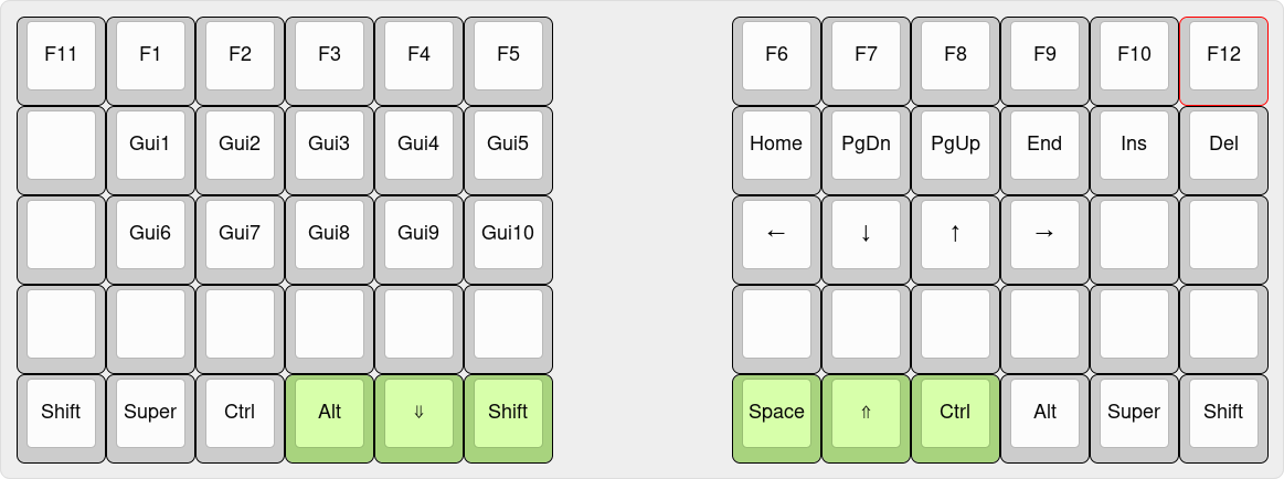
raiselayer. By not having the arrow cluster of a classic keyboard I feel much faster and my hand doesn’t have to move every time I have to move my cursor.
Base Layer
base layer on keyboard layout editor
Raise Layer
raise layer on keyboard layout editor
Lower Layer
lower layer on keyboard layout editor
There are a lot of unused keys in the layers but all my current needs are totally covered. The unique “special” keys are the GUIX (GUI+number) keys to switch between desktop workspaces.
The QMK layout is on github (will open a PR upstream to ask to incorporate it).
Switches and KeyCaps
Another important part are the keyboard switches and the keycaps.
Currently I’m very happy with 62g Zealios and SA profile keycaps (the one in the image are Dasher and Dancer SA).
The Future
Keyboards
While I’m really happy with my nyquist I have different ideas to improve it:
- Better thumb keys placement
- Staggered Columns layout (like the atreus)
These are perfectly covered by the iris keyboard. The unique thing I’ll be missing are the lower keys where I put all the additional modifier. I really need them (without doing Mod Tap like described above) so I’m really tempted to improve the iris to add these missing keys.
Laptop
I primarily do remote work from home but when I need to go to a customer I have to bring my laptop but its base and keyboard occupies the place where I should put my mech keyboard. My future laptop must be as powerful as my current one (4 core/8 threads, 16GB Ram, HiDPI display) but without that unuseful keyboard/touchpad/base or at least being able to not have it on the desk (for example a 2 in 1 laptop) and, of course, it must run only GNU/Linux.
Thanks
- To jackhumbert and all the QMK contributors: https://github.com/qmk
- To keeb.io and u/bakingpy for the great keyboards and for open sourcing most parts (I’m going to wait for opensourcing the PCBs).
- To jackhumbert for the ortholinear keyboards: https://olkb.com
- To technomancy for the atreus keyboards: https://atreus.technomancy.us
